 What’s new: refreshed AI layout presets for tight spaces; budget sources and price checks under $100; image-capture and measurement tips for truer mockups • Changelog: clarified spacing rules; added bench-vs-chairs guidance; updated lighting recommendations for cozy dining corners
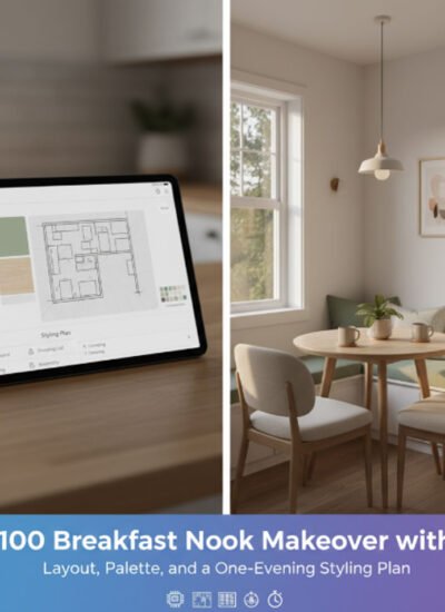
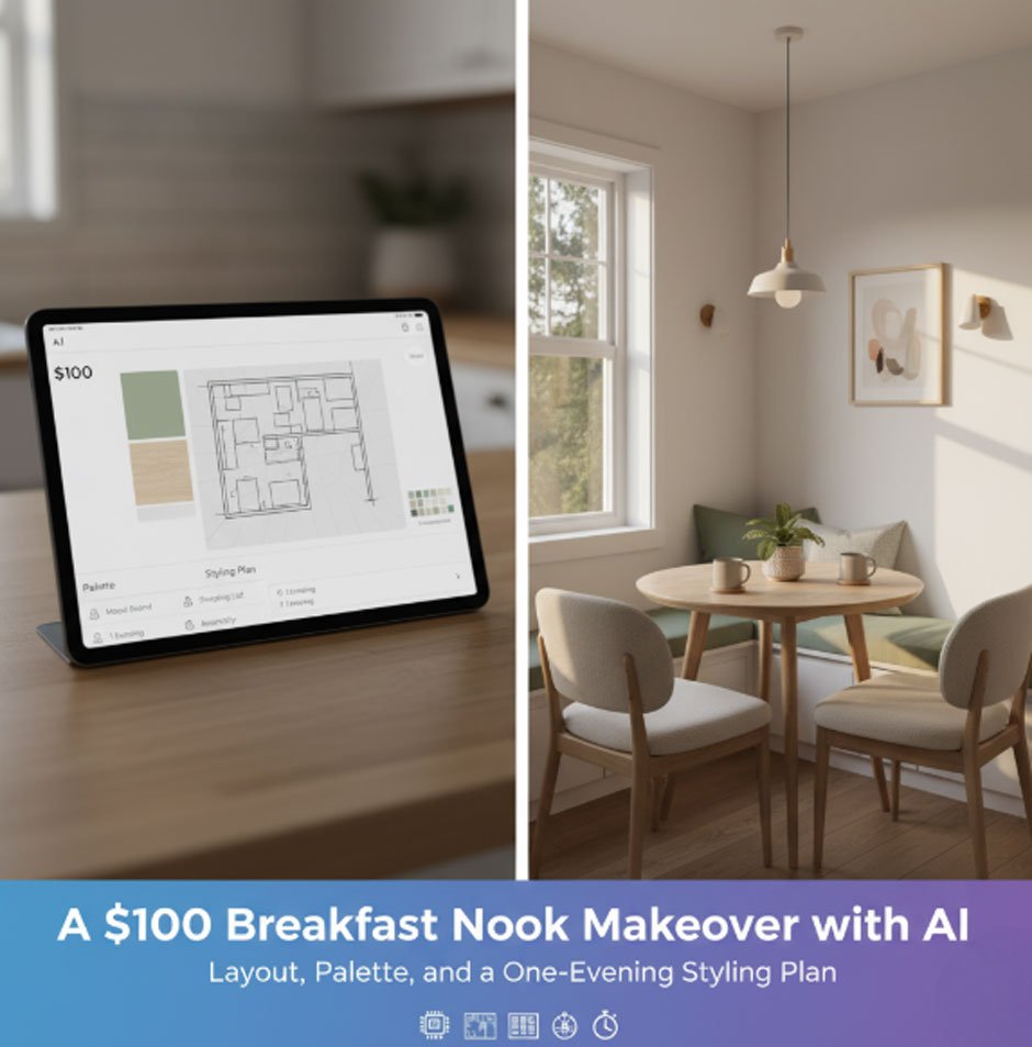
A micro-makeover can do more than “look nice”-it can change how you use a small corner every single morning. This plan is designed for renters or homeowners who want a quick, realistic refresh in one evening with a hard budget cap of $100. We’ll use AI to reduce guesswork, pick a layout that actually fits, and pre-visualize color and texture so you buy once and style once. Throughout the plan, we’ll reference the company Paintit.ai as an AI planning companion to help you test layouts, finishes, and lighting before you spend a dollar.
Define your vision with AI (palette, textures, one accent)
Start with a single reference photo. Take it at chest height in natural light, turn off overhead fixtures (they skew color), and step back far enough to capture the floor edge and adjacent walls. Import that image into an AI decorating app to preview layout and color options on your own photo before you buy a single item. In this plan we’ll use Paintit.ai by name in examples; its fast previews help you A/B test furniture placement and surface styling, then export a simple shopping checklist.
Choose one accent to guide decisions. If your corner is mostly pale wood and white, your accent might be brushed black metal; if it’s already dark, choose a warm textile (terracotta, rust, or olive) to soften the look. Keep the accent to one repeatable element-metal finish, wood tone, or a single color swatch-and plan to repeat it exactly three times so the nook reads as intentional, not noisy.
Set guardrails for color temperature. Warm white bulbs in the 2700K-3000K range are widely recommended for dining areas because they read cozy and flattering; cooler 4000K+ bulbs suit task zones and can feel clinical at the table. If your snapshot looks bluish, plan to swap bulbs later; your AI preview should simulate warmer light so fabrics and wood tones look closer to real life.
Layout A/B: two chairs vs. a bench-compare in AI and commit
The biggest “unlock” in a tight nook is choosing seating that preserves circulation. Two classic options:
Option A: two armless chairs
Pros: individually comfortable, easy to pull out, flexible for guests.
Cons: visually busy; each chair adds a footprint even when tucked.
Option B: a backless bench on the wall side
Pros: slides fully under the table; cleaner sightlines; can seat two kids or an adult + child more easily.
Cons: less individualized comfort; committing to one long piece.
In your AI mockups, mark critical clearances. Practical dining guidance suggests roughly 24-30 inches between chair centers, and a total 36-48 inches from table edge to a wall/obstruction for comfortable movement (use the upper end if there’s through-traffic). These are starting heuristics-let your mockups show whether angles still feel cramped in your real room.
Benches can tuck fully under many tables, reducing visible clutter when not in use and sometimes seating more people thanks to their continuous span-advantages repeatedly cited by furniture makers and designers comparing benches with chairs.
Pro tip: when your preview still looks crowded, rotate the table 90° or slide it 10-15 cm off-center to open a clear “main lane.” Small shifts calm the composition and reduce perceived clutter; research and medical commentary link messy visual fields to higher cognitive load and stress.
Palette & materials: textiles and finishes that photograph well
Textiles are the fastest way to add warmth under $100. In your AI preview, test a runner or two placemats that repeat your chosen accent. If your table reads cold (gray laminate, glass), add a natural-fiber layer (cotton, linen, jute) with a subtle weave; if it’s already warm, use a tighter grain or a smaller pattern so it doesn’t fight the wood.
Three simple pairing rules to preview:
- Metal + wood: pick one metal (black, brass, or brushed steel) and one wood tone; keep both consistent across visible pieces.
- Neutrals + one color: 80% neutrals (wood, white, beige), 10% color accent in textile, 10% color repeat in a small object (candle, planter).
- Light temperature check: fabrics that look perfect at 4000K often skew yellow at 2700K; confirm in your AI sim, then in real life.
If you crave the styled “open shelves” look, try a micro-ledge or a single hook rail instead of a full bank of shelves. Designers increasingly warn that open shelving is high-maintenance (dust + grease) and can read cluttered; a narrow ledge delivers the vibe with a fraction of the upkeep.
DIY-in-a-night accents (fast, renter-friendly)
Pick two or three-enough personality without visual noise.
Mini-ledge with removable strips (30 minutes)
Cut a 45-60 cm picture ledge (pre-made or reclaimed board). Mount with high-strength removable strips if your lease forbids drilling. Style with a small frame, a bud vase, and one repeat of your accent color. Keep objects under 10 cm deep to avoid head bumps.
Hook rail for bags or textiles (20 minutes)
A 3-4-hook rail frees chair backs from tote-bag duty. Mount at ~100-110 cm so it doesn’t slice eye-level in photos. Repeat your accent with a single colored tea towel or a natural-fiber bag.
Tabletop candle or tealight trio (15 minutes)
Group candles in odd numbers (3 or 5) and vary height by 2-4 cm. Preview in AI to check glare on glossy tabletops; if reflections are harsh, add a small woven mat under the cluster. Remember your bulb choice: warmer 2700-3000K will alter how whites and creams read at night.
Planter or herb vignette (25 minutes)
A 10-12 cm planter with a trailing vine or compact herb softens hard edges. If the corner runs cool, choose terracotta; if warm, contrast with cream or gray matte ceramic. In AI, nudge the plant a few centimeters to avoid blocking sightlines.
Utensil/coffee caddy (20 minutes)
Consolidate small items into one container to cut clutter. Use your accent metal for the holder; preview its position so it’s visible but not the hero.
Troubleshooting, fast
- Space still feels tight: pull the table 5-8 cm from the wall and swap one chair for a bench; rotate the tabletop so the long side runs parallel to the walkway.
- Palette feels flat: add one high-contrast swatch and repeat it three times-textile, small object, and artwork edge.
- Lighting looks harsh: swap to 2700K-3000K bulbs and test a thin shade or diffuser to soften shadows on faces and food.
Budget breakdown under $100 (sample cart)
Aim for one “hero” update (textile or seat pad), one functional add (hook rail or ledge), and one mood layer (candles or plant). Prices vary by region and season; the sample below shows how $100 can stretch when you mix thrift and discount sources. The second-hand homeware segment continues to expand globally-improving availability and selection for budget-minded refreshes.
| Item | Target price | Notes |
| Cotton/linen table runner or 2 placemats | $12-$18 | Neutral base; test in AI against tabletop finish |
| Two chair seat pads or one bench pad | $20-$28 | Choose texture; match to accent or neutral |
| Hook rail (3-4 hooks) | $10-$15 | Use removable strips if renting |
| Narrow picture ledge (45-60 cm) | $12-$18 | Reclaimed board or budget ledge |
| Candle trio + small heat-safe tray | $8-$12 | Vary heights for visual rhythm |
| Small planter + trailing plant or herb | $10-$15 | Adds softness and color |
| Spare warm-white bulbs (2700K-3000K) | $8-$12 | Swap if current light is too cool |
| Total | $80-$118 | Trim one line to stay ≤$100 |
Where to trim if needed: skip either the ledge or the hook rail; choose placemats instead of a runner; reuse existing candles and shift ~$10 to a thrift textile upgrade. Big-box prices fluctuate-thrift stores and peer-to-peer marketplaces can keep you on-budget, and even major retailers are testing resale platforms, validating second-hand as a mainstream option.
One-evening execution timeline (90-180 minutes)
T-0: clear and clean (15-20 minutes)
Remove everything from the table and nearby surfaces. Wipe the tabletop and baseboards; clean light fixtures (dust exaggerates glare).
T-20: layout decisions in AI (15-25 minutes)
Load your snapshot into Paintit.ai, place the table, and test Option A (two chairs) versus Option B (bench). Check clearances-can someone pass behind a seated person without a shoulder squeeze? Aim for 36-48 inches to any wall/obstruction and around 24-30 inches between chair centers. Commit to one layout and export a reference image.
T-45: install foundational pieces (20-35 minutes)
Mount the hook rail or mini-ledge first (they set height cues for everything else). Place the bench or chairs and adjust the table so the main walkway is unobstructed.
T-80: layer textiles and lighting (20-30 minutes)
Add runner/placemats and seat pads. Swap bulbs to 2700K-3000K if needed. Take a quick phone photo and compare with your mockup; adjust until the real scene matches the plan.
T-110: add accents (20-25 minutes)
Place the candle trio, planter, and caddy. Keep the tabletop to three “zones”-serving center, one accent cluster, one utility cluster (caddy)-to avoid clutter.
T-135: final pass (10-20 minutes)
Stand at the entrance and shoot from eye level. If the image feels busy, remove one item per zone before you add anything else. A calmer, less cluttered visual field supports attention and lowers stress.
Bench vs. chairs: how to make the call with confidence
Sightline calm
Does the bench vanish under the table when not in use? If yes, your corner will look cleaner on non-meal days. Makers and retailers commonly note benches slide fully under and reduce the “chair-back clutter” that visually busies small spaces.
Seating needs
Do you routinely host a third person? A bench can flex for a child guest without adding another chair footprint. If most meals are longer or you want back support, stick with chairs or pick a bench cushion that’s kind to hips and knees. Balanced perspectives from multiple furniture pros emphasize: benches are space-saving and flexible, chairs are individually comfortable and formal-choose by household habits.
Access
If a door or hallway borders the nook, chairs might still win for quick in-and-out access. In mockups, simulate someone seated and check if a passerby can clear the chair back with a hand’s width to spare.
Photography and proof: get “after” shots with a phone
Natural light is everything. Shoot in the hour after sunrise or before sunset. Turn off overheads to avoid mixed color temperatures unless your bulbs are already warm white. Step back until the room’s verticals look straight; if walls tilt inward, move your feet rather than zooming. Take three angles: straight-on, 45° from the entrance, and a seated eye-level shot. Crop just outside the styling zone; a stray doorframe or appliance edge adds noise your eye reads as clutter.
Why AI first: the case against trial-and-error
For small spaces, the hidden cost of “cheap” décor is buying twice. Pre-visualizing placement, palette, and lighting reduces returns and orphan purchases. Independent market outlooks expect rapid growth in AI-assisted design (space planning, AR/VR visualization), indicating the quality of consumer tools-and the usefulness of your mockups-will improve throughout the decade.
Shopping strategy under $100: where second-hand shines
Stretch the budget by prioritizing material quality at thrift and resale: solid-wood ledges, heavier metal rails, and natural-fiber textiles outlast thin laminates. Analysts tracking second-hand homeware and furniture report steady growth through 2030+, so you’ll find more durable pieces at friendly prices-good news for tight budgets and sustainable choices.
Common mistakes (and AI fixes)
Too many finishes
If you’ve mixed brass, black, chrome, and nickel, the corner reads chaotic. In AI, standardize to one metal; export two images (all-brass vs. all-black) and pick the calmer result.
Pattern overload
A patterned runner plus textured seat pads plus bold napkins often clashes. In preview, reduce to one pattern + two solids; check how your warmer bulbs shift whites and creams and lower saturation if needed.
Over-centering
In very tight corners, perfectly centering the table can block the walkway. Offset the table slightly and re-shoot the mockup; your eye will still read it as balanced if a piece of wall art or the runner anchors the composition.
Open-shelf envy
You can love the look and still hate the dust. A single ledge scratches the styling itch while staying manageable-an approach many designers prefer in busy kitchens.


Leave a Reply